


Finance is drowning in a deluge of data. Humans are not very good at comprehending large amounts of data. One way out may be visualization.
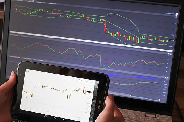
Traditional ways of visualizing patterns, complexities and contexts are of course charts and for derivatives e.g. payoff diagrams, a more modern approach are heat maps.
My question:
Do you know of any innovative (or experimental) ways of visualizing financial and/or derivatives data?
Answer:
Visualization should lead to truth and understanding. As such, I find that simple visualizations tend to be the best. My favorite visualization for showing relationships is the scatterplot. Once you start to even introduce a line plot, you are implying continuities between data that may not exist. And trying to introduce more advanced visualizations like network diagrams (ex) or complicated pie charts (ex) can lead to more confusion than understanding if misapplied.
A few thoughts:
- I think that you have already mentioned a few good ones. Heatmaps are good because they allow you to show three (or more) dimensional data without the added issues that arise when trying to create a 3D visualization. Payoff diagrams are simple but they accomplish their goal efficiently as a result.
- The FinViz website has a few nice examples of visualizations, including a simple bar chart, candlesticks, and heatmap.
- People often don’t consider that it is possible to include more dimensions in a typical plot by changing the width, size, color, or intensity of a shape. This is a much better idea than trying to plot more than 2 dimensions spatially.
- The fourth real dimension is time, and time plays a very important role in financial data. One popular way to incorporate this as another dimension in a visualization is through video. A great example is gapminder, the software created by Hans Rosling, which made for some very compelling TED talks about global poverty. This was acquired by google and is now available as part of their web toolkit(also mentioned by Ben Hoffstein).
Visualization techniques from other fields are still very appropriate in finance, and the best starting point is Edward Tufte, especially “The Visual Display of Quantitative Information” and “Envisioning Information”. You also can get a benefit from learning a visualization language. I recommend any of these three (in order of complexity):
- R with ggplot2
- Protovis
- Processing
These each have a learning curve, but once you learn how to use them they all allow for exploratory data analysis in a way that can’t be achieved with other tools.
There are also many great and innovative commercial tools. To mention a few that are all used by banks and hedge funds:
- Panopticon does an amazing job with real-time visualization.
- Tableau, Spotfire, and Qlikview all allow for interactive visualization of data using in-memory databases.